This is a reblog from our exclusive design partners at Dauphine Press.
With Pantone’s recent announcement of Color of the Year for 2015, we thought one of our Get the Look posts would give our design team an opportunity to express their admiration for marsala! The details below explore our current favorite way to incorporate this strong color into you wedding stationery.

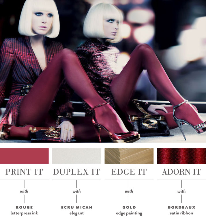
Rich color and elegant foil are the standout elements in this Gucci ad. Imagine your wedding invitation printed in our deep rouge ink on an ecru micah duplexed paper stock. The highlight of the suite are the mixed metallics with the gold edge painting on the thick shimmering card. Embellished with a luxurious bordeaux double-faced satin, this suite has the power to make a bold, strong statement.
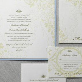
Visit one of our exclusive retailers (editor’s note: such as Paper and Home!) with your inspiration in hand to get started on making your own statement with your custom letterpress invitation design!
—
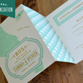
In our regular Get the Look series from the Dauphine Press design department, we share some of our favorite hot new style finds and make suggestions for how you can translate the same look into your wedding stationery using the many custom elements available to you in our design library. Keep in mind that ALL of our stationery suites receive a designer’s touch and every one of our designs is customizable. Pairing the color palette and embellishments above with any of our motifs or fonts allows us to create a stationery suite that is unique to you!
SHARE THIS ON:


Related Posts
Presidio Inspired Letterpress Save the Date Card (REBLOG)
Hot Air Balloon Letterpress Baby Stationery by Dauphine Press [REBLOG]