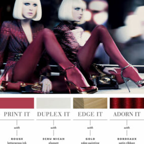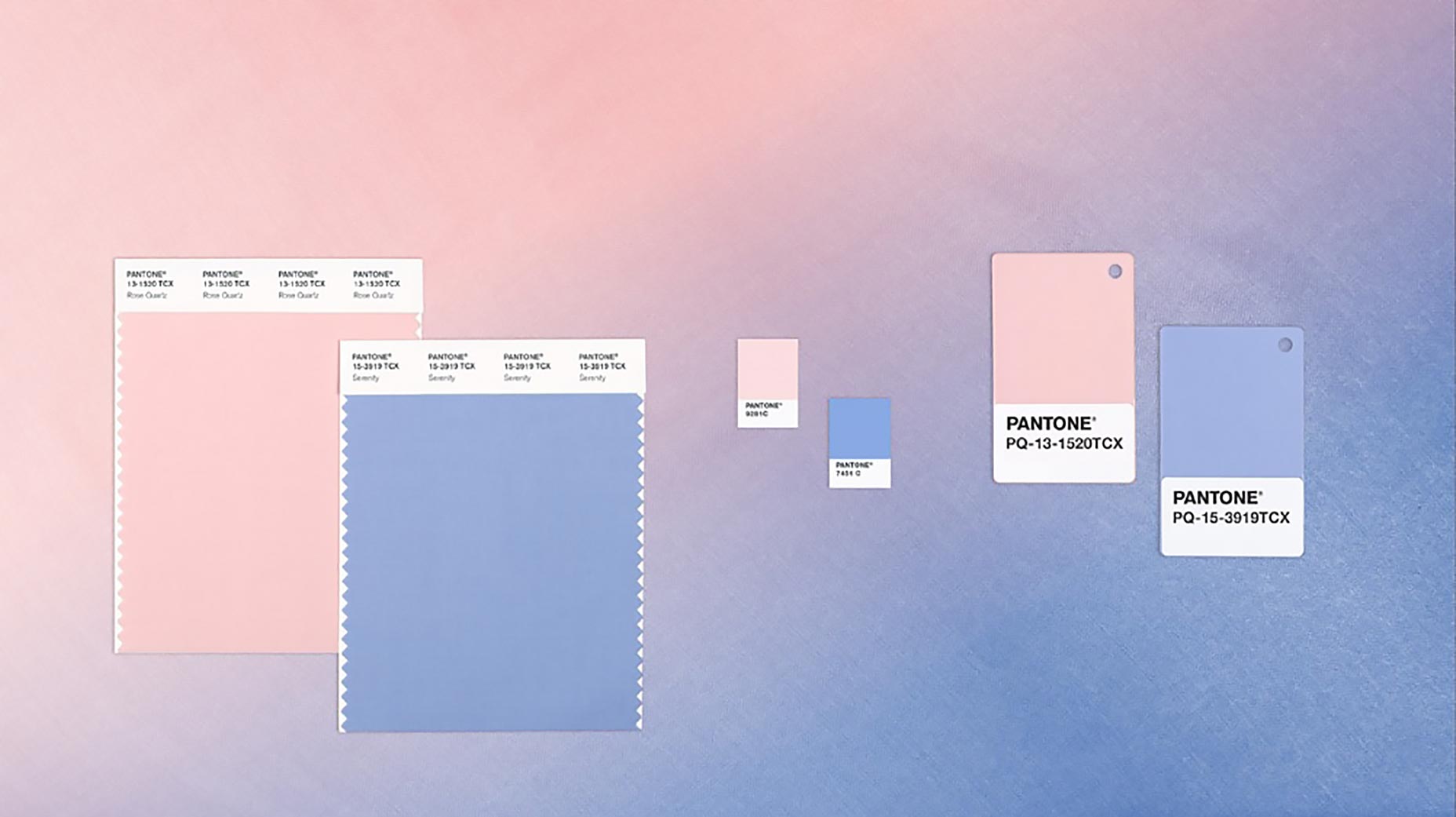
A softer take on color for 2016: For the first time, the blending of two shades – Rose Quartz and Serenity are chosen as the Pantone Color of the Year.

As consumers seek mindfulness and well-being as an antidote to modern day stresses, welcoming colors that psychologically fulfill our yearning for reassurance and security are becoming more prominent. Joined together, Rose Quartz and Serenity demonstrate an inherent balance between a warmer embracing rose tone and the cooler tranquil blue, reflecting connection and wellness as well as a soothing sense of order and peace.
Visit the Pantone website for more details on why they chose this as the color of the year.
SHARE THIS ON:


Related Posts